
The Color Theory Behind Productivity
Looking for a way to boost your mood about the tasks cluttering up your calendar? Or want to choose the right place on the color wheel for your mindset? We've rounded up some of our favorite theme colors so you can find the complementary color to your outlook.
We didn't major in color psychology, but we do believe that color choices define and reflect the intentions of their space. That's why we've always had the ability on TeuxDeux for anyone to choose any main color for their theme.
How to Choose a TeuxDeux Theme to Match Your To-Do Mood
So, how does one choose the right color for their tasks? It's all about personal choice and preference.
We asked our team, and they rounded up some incredibly fun color palettes with themed moods to match. But like we said before, we're not certified color theorists so don't take our color schemes as anything more than fun suggestions.
A quick warning: some color combinations just don't work well on TeuxDeux – they interfere with the existing color harmony. We'd avoid most shades of grey since we use grey to signify past days and completed items. One also might find issues with shades of very dark or very light shades if they like to toggle between light and dark mode on the web. Suddenly, all their current day to-dos might disappear! We've done our best to avoid suggesting those colors in this post but wanted to give you the heads up as you explore.
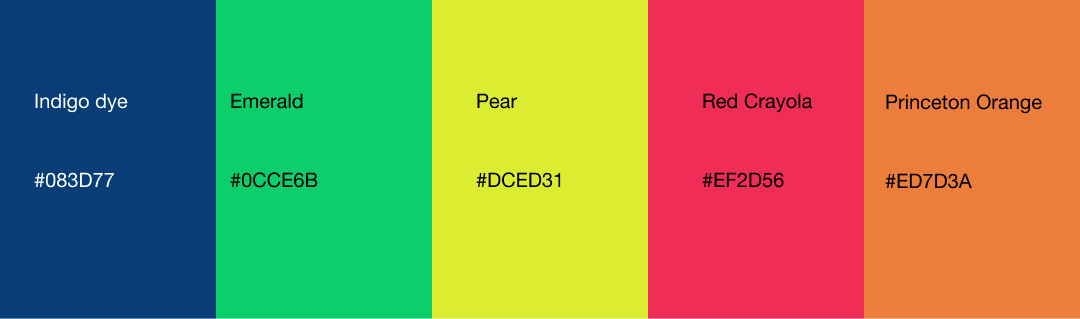
Color palette #1: 'Skipping skittles'
These colors are playful to reflect your excitement to get the work done. Choose from these bright, boisterous colors to get yourself 100% motivated and smiling.
Indigo dye #083D77
- This deep purple-blue can add vibrancy to any mysterious expedition or investigation – use it when spending long days in the library.
Emerald #0CCE6B
- Dramatically bright, choose this green when party-planning is on the agenda.
Pear #DCED31
- A greenish-yellow, this is the perfect autumn shade for back-to-school time. It helps that it reminds us of the classic yellow pencil.
Red Crayola #EF2D56
- With hints of pink, this warm red is friendlier and softer than the current TeuxDeux red. Select this one to brighten up some dismal tasks – like visits to the DMV.
Princeton orange #ED7D3A
- You've got a list of things to do that are worthy of Ivy League college admission, and you're pretty dang excited about each one of them.
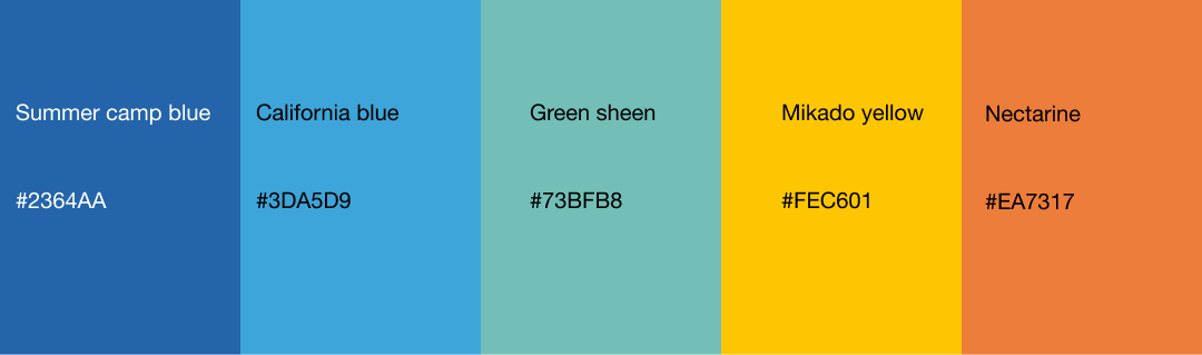
Color palette #2: Sunshine kid
Dreamy colors to reflect the west coast and tasks that are aspirational, but just on the horizon.
Summer camp blue #2364AA
- Fire pits, s'mores, and games. This kind of true blue always kicks up feelings of nostalgia and old friendships. Use it to infuse your agenda with memories, for those tasks that involve visiting your hometown.
California blue #3DA5D9
- Stir up a sense of adventure in your planner with this color that looks how salty ocean air smells.
Green sheen #73BFB8
- An aqua for anyone dreaming of vacation time (but stuck WFH'ing). Keep your spirits high and remember to use your PTO when you need it.
Mikado yellow #FEC601
- A wheat yellow, we'd choose this color when we want to reflect on our obligations and be grateful for all we're able to harvest (by getting our tasks done!).
Nectarine #EA7317
- Sweet and tangy, use this one for when you have a bunch of little to-dos to do.
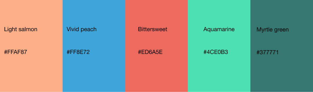
Color Pallet #3: Coral Desert
A slew of warm colors for elaborate, intricate, and elegant tasks.
Light salmon #FFAF87
- A smoky, dusty pink, perfect for that wedding planning you need to start.
Vivid peach #FF8E72
- A basic color that pleases all, and perfectly fitting for a not-so-basic bridal shower.
Bittersweet #ED6A5E
- Like its name, this hard pink carries a multitude of emotions (many contradicting) in its hue. Use it for when your to-do list is filled with stuff you're sort of dreading, but think might be fine?
Aquamarine #4CE0B3
- A neon blue-green, reflecting elegant plans for late-nights.
Myrtle green #377771
- An extravagant color, perfect to choose when your list is filled with items putting you over your party-planning budget and you don't care.
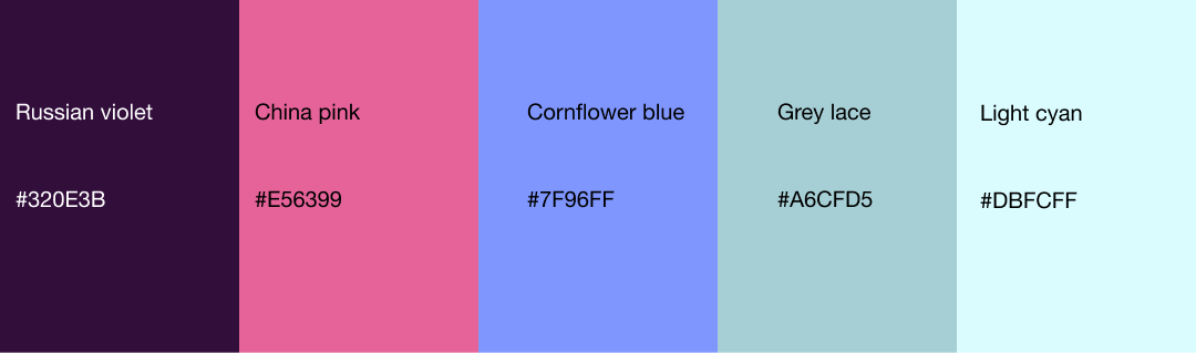
Color Pallet #4: Fancy Traveler
Filled with cool colors, these shades burst with a promise: of travel, adventure, and good things to come.
Russian violet #320E3B
- Dark and stormy: use this when your to-dos are items that demand broody introspection.
China pink #E56399
- Fresh and sweet: use this when your to-dos are items that demand grace and ease.
Cornflower blue #7F96FF
- This purple-blue hue is carefree and solid, like time spent in good company. Select it when your list is filled with things you'd rather not do, and look forward to the future.
Grey lace #A6CFD5
- A classic color that evokes rainy afternoons and do-or-die tasks.
Light cyan #DBFCFF
- Go high-contrast and set your dashboard to dark mode for tasks that demand you burn the midnight oil.